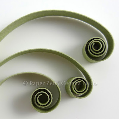
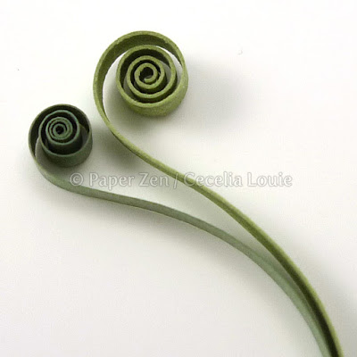
I've sometimes heard people say they're intimidated to try quilling. My gut reaction is to say "WHAT?!?". Then I want to grab a round toothpick, tear a scrap piece of paper from the weekly flyers, and show them there is no cost to trying it once, to see if they like it. Like introducing someone to new food, I'm hoping their eyebrows go up and then they're diving in for another bite - there is no better happiness for me than someone else sharing your love. Like a magician who demystifies a simple, yet seemingly incredulous trick, I want to entice them into my world and fall in love with paper in a way they didn't know was possible. To me, it's simply PLAYING!
Now I'd like to admit something. I've wanted to quill something like this BE-YOU-TIFUL type for a very long time, but had so many negative voices in my head, or what sounded like good reasons to me, but were really excuses not to attempt this project. Then I slowly came to realize I was intimidated, just like those who were hesitant to try quilling! I finally came around, had fun doing it, and sharing it along the way – the good, the bad, and the ugly gluey bits.
To help me get to this state of mind and acceptance of myself at this point in time, I have been watching Liz Gilbert on Oprah. For me, it was pivotal. Liz says about perfectionism: "It's just fear in really good shoes". So with this series, I hoped to show more of what I struggled with, what I knew, where I had my doubts, so that you can all see more than just the end of the journey, when all the glue bits are cleaned away. I realize it may appear to magically come about, but in reality, I'm working hard at it too, so don't give up when you're frustrated that it's not going as you planned.
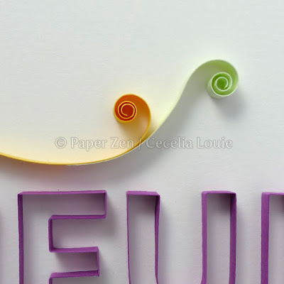
At this first stage, the letters were complete, and I started on the fluid arcs. It was so exciting to imagine what it could be. I really liked the bright yellow contrasting the violet, and committed to some key strokes because I knew I wanted the eye to flow the way it's shown here. The YOU letters were asymmetrical, and I wanted to balance it with the entire word, hence the longer stroke to the right.
I wanted movement and vibrancy to come bursting out of YOU, as if it were your personality being let free, and allowed to flourish, breaking the boundaries at the tops of the letters.
At this point, I had to glue down the arcs because as I kept adding without gluing, the strips were colliding with one another and knocking each other over like dominoes. So I basically committed to this skeletal structure.
Then I hit a wall, at the awkward, teenage phase, when it was too late to undo some core elements. The right hand stroke that I initially loved so much was irritatingly limiting because it constrained the area and didn't allow more arcs to come out of the other half of the U.
At this point, I wanted to scrap it, and start over. The arcs within the O were too even. The bottoms of the letters were not flowing with one another, like they were on top. I realized I should have pre-planned the fluidity between the letters better. The Y-O-U felt like individual letters, not a word in itself.
Each morning I'd look at this and wonder how to make it work. I'd try strip after strip, varying the colors or the strokes, and really felt in doubt about it all. I couldn't commit to gluing another strip for days and tried endless combinations, in full doubt of what I was doing. I wanted to end this series of posts without showing the final word, because I never promised I was going to explain that part anyway – you know, just in case my fears were realized and it didn't turn out well, so my embarrassment would never be public.
It's not perfect and I can see so many areas I want to improve, but as Liz says, it's better to have something "good" finished, rather than something wanting to be "perfect" stuck in my drawer. I have learned so much in doing this project, and that is the part I will treasure as I look at this piece on my wall.
Thank you all for coming along on this ride with me. Believe me, I understand the intimidation. Gluing the letters, while technically challenging, was not intimidating to me, because it's mainly production after choosing the size and font. Gluing the airy arcs, balancing the colors, the lengths, which ones would come out of the letters, etc - that was the intimidating part because I can't very well erase and start over again. Gluing the arcs down was a commitment – after all, the word was an investment of so much time. I'm glad I struggled through it, trying idea after idea to come up with a solution that felt ok.
If you've just started reading this post, you might enjoy the other parts of this series:
- Quilling Letters 101 - Part 1 Kissing Glue
- Quilling Letters 101 - Part 2 Tracing Letters
- Quilling Letters 101 - Part 3 Joining Corners
- Quilling Letters 101 - Part 4 Gluing Letters in Stages
- Quilling Letters 101 - Part 5 Joining Curves
- Quilling Letters 101 - Part 6 DIY Quilling Paper Strips and More
I hope you are inspired to try something new with this series of posts, and go beyond your safety zone. Let go of your fears, and be YOU!
I'm grateful to all of you who comment and give your feedback. Your helpful insights help me grow!
Cecelia


